Two design leaders explained this week why design work goes unseen inside most companies. I'd argue they are both right, but their advice takes months or years to pay off, and the reality is that you have a design review on Thursday.
Design does not need the business to change how it counts.
It needs its own number.
The diagnosis, twice
Peter Merholz calls it design's legibility gap. He takes the idea from James C. Scott's Seeing Like a State, and a story about Prussian foresters.
The state wanted timber money… so it measured the forest in board feet. A board foot is a piece of wood a foot wide, a foot long, and an inch thick. It's how you count the money in a tree.
Everything else in the forest had no number, so it counted as nothing. The state cleared the undergrowth, the deadfall, the moss, and the shrubs, then planted the trees in tidy rows. The first crop grew beautifully. The second one died. All that cleared material had been feeding the soil and keeping insects in check. The forest had been living off the parts nobody was counting.
Merholz's argument runs like this. Companies have to plan, so they have to predict. To predict something, you need to know ahead of time what it will produce. Work that can't tell you ahead of time doesn't get counted, and work that doesn't get counted doesn't get seen.
A lot of design work can't tell you ahead of time. You don't know which of four concepts wins until you've drawn all four.
Then he gives the history. Engineering, marketing, sales, finance, and operations all went through business rationalization together. They entered MBA curricula, standardized their measurement, and picked up a shared language of models, pipelines, and funnels. Design never went through that. Its rigor came from studio traditions, HCI, and the social sciences, which are perfectly sound and completely illegible in a boardroom.
The Viable System Model
Daniel Teixeira Santos reaches the same diagnosis through Stafford Beer's Viable System Model. Beer's model splits a company into layers. The bottom layer makes things you can count. Tickets closed, orders shipped, revenue booked.
The layers above it hold the whole thing together, and they produce nothing countable in the quarter the work happens. Companies read the bottom layer and skip the rest. Santos says there's no point asking leadership to value the rest. The system was built to count one thing, and it's going to keep counting that thing no matter how well you explain the rest.
Both are right about the problem.
Where their argument ends is the part I want to push on.
Both of them are waiting
Merholz's idea is to change what the business treats as worth counting. Widen the aperture. Get leadership to appreciate work that is open-ended and exploratory.
I want that to work.
But the company keeps running on numbers the entire time you're trying to change its mind about numbers. Budget gets set on numbers. Headcount gets set on numbers. Nobody pauses that while design makes its case.
Changing what a company values takes years of steady proof. Most design leaders I talk to are trying to get through the next two quarters.
A senior design leader I worked with last month had just spent a week defending why her team should exist. She wasn't arguing against Merholz. She'd like leadership to value the work too. She just needed a number by the end of the week, and appreciation wasn't going to show up that fast.
Santos saw the same problem and gave different advice. Pick a number the business already tracks, one your work is quietly moving anyway. His examples are real ones. How many days it takes to pay a warranty claim. How many times a person has to physically handle a return. How many support calls come in about late orders. Decide up front which number your work should move, then report against it when you're done.
That's better advice, and it has one problem. Every one of those numbers belongs to somebody else and sits on somebody else's dashboard. They also only move after the work ships. The meeting where the work gets approved or killed happens months before that, and you walk into that one with nothing.
So one is waiting for permission and the other is waiting for proof from a system design doesn't control.
The third option
Design can make its own numbers. We call them UX metrics.
Take the two directions you're arguing about. Put each one in front of its own group of a hundred people, matched to the same audience, and measure how each one performs on its own. Now you have two numbers you can set side by side.
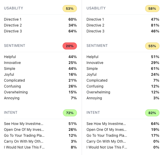
Those are rates. You can compare them to the next test you run. They're built on what people did and said. These are numbers stakeholders can learn to trust, and you can correlate them back to the lagging business metrics they already watch.
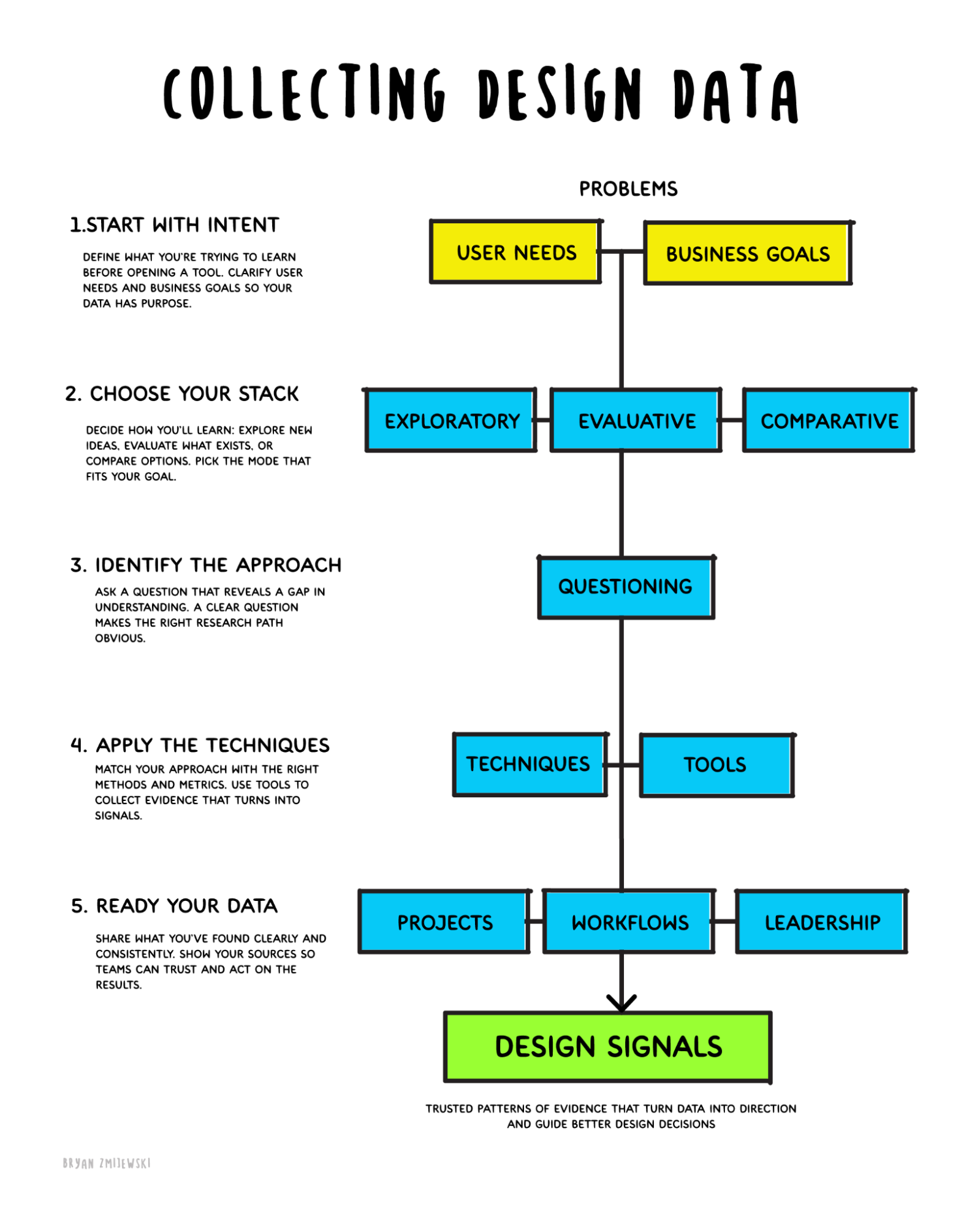
Merholz treats design's invisibility as something built into the work itself. Part of it is. You explore four concepts and keep one. The three you set aside produce nothing anyone can count, and you couldn't have said in advance which one you'd keep. That's where UX metrics start shaping the discussion.
You can put those concepts in front of people the same way marketing does, before you ever ship. That has been possible for twenty years. Most teams don't spend the time.
I'd argue a lot of design teams are apathetic about this. They don't want to do the work, or they don't think it's design's job, or they don't see a long-term payoff. That last one makes sense to me. Connecting design data to strategy takes many quarters, and most teams never get the runway to see it through.
That doesn't mean we skip everyone else's numbers. Marketing numbers, analytics, sales numbers, they're all part of the story.
The problem is where you start. If you start with somebody else's numbers, you can still argue for a decision, but you're laying it on their foundation. Design data is where you own the foundation of the argument and start building credibility from how people actually behave.
The forest objection
Here's the objection using the forest analogy. Get design counted and design becomes the thing that gets counted. Teams start driving up completion rate and lose whatever made the product worth opening in the first place. You've cleared the undergrowth.
Two ways to address this.
The first is what the number is for. A UX metric is an orientation number. It tells you where the problem in the design is, and it gives you something specific to talk through with stakeholders instead of trading opinions. It doesn't grade you.
This is also why we use a stack of UX metrics instead of one. A design team can take a single business metric and let it shape everything, which is the forest problem exactly. A stack orients you and gets you to clearer answers.
That's where most teams go wrong in the other direction. Too many times I've watched teams run tests as a box to check, with no intention of changing anything based on the result. That's the forest again. Running a test to confirm you were already right is the same mistake as counting only the lumber.
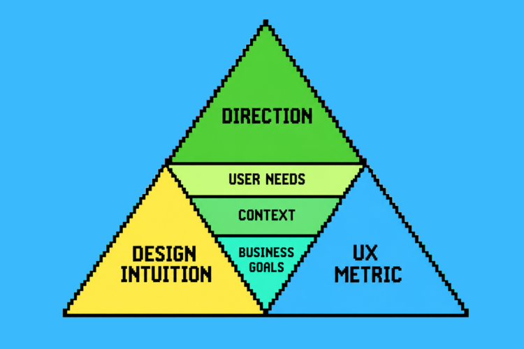
The second answer is that the number was never supposed to travel alone. What goes into the room is a design signal, and there's more in it than a number. Design intuition supplies the why. The UX metric supplies the evidence. Underneath both sit the user need, the context, and the business goal. Direction sits on top.
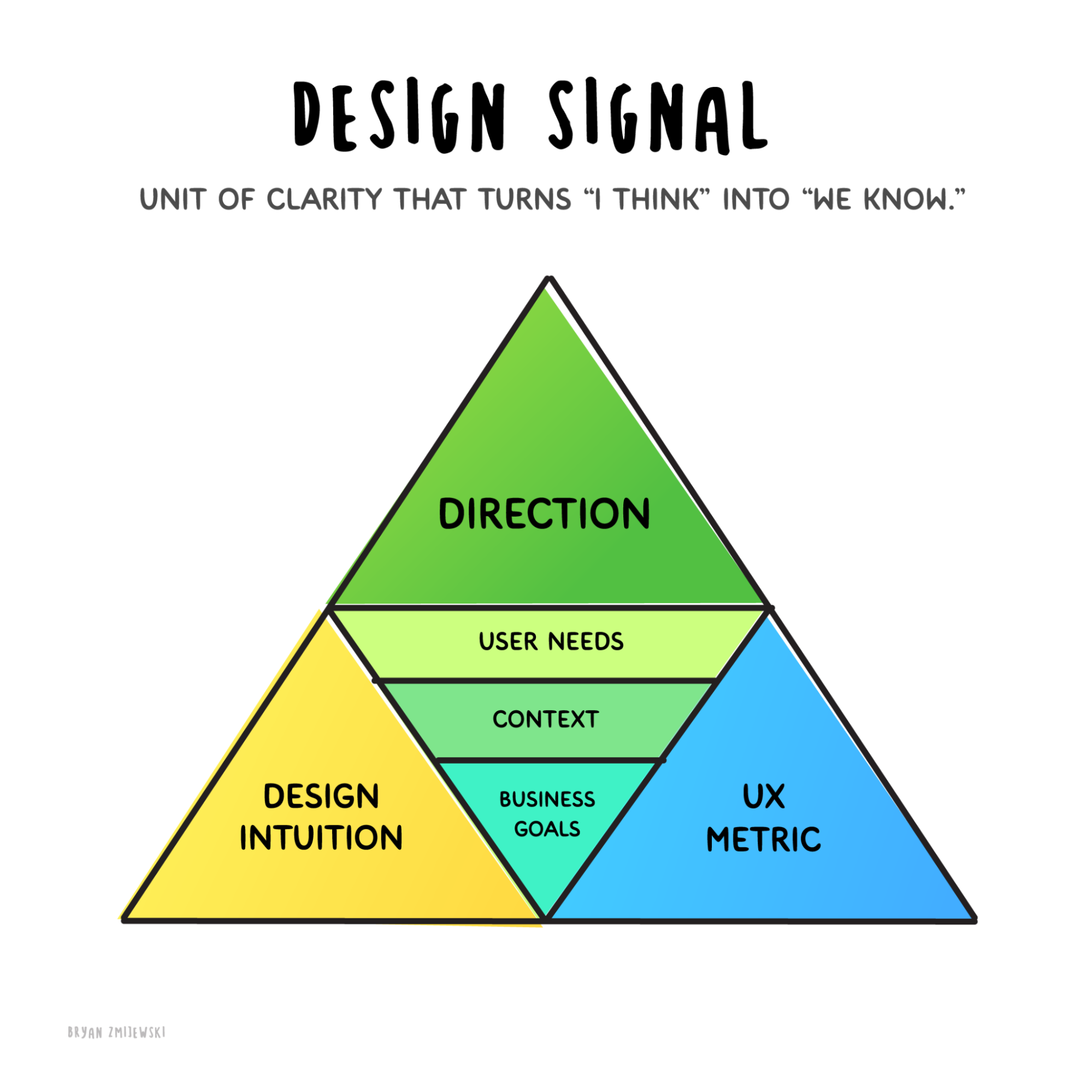
Direction is the piece people have the hardest time communicating, and it's the piece they most want someone else to supply. Direction is also the accountability. If you're pushing a direction, that's what you get held to.
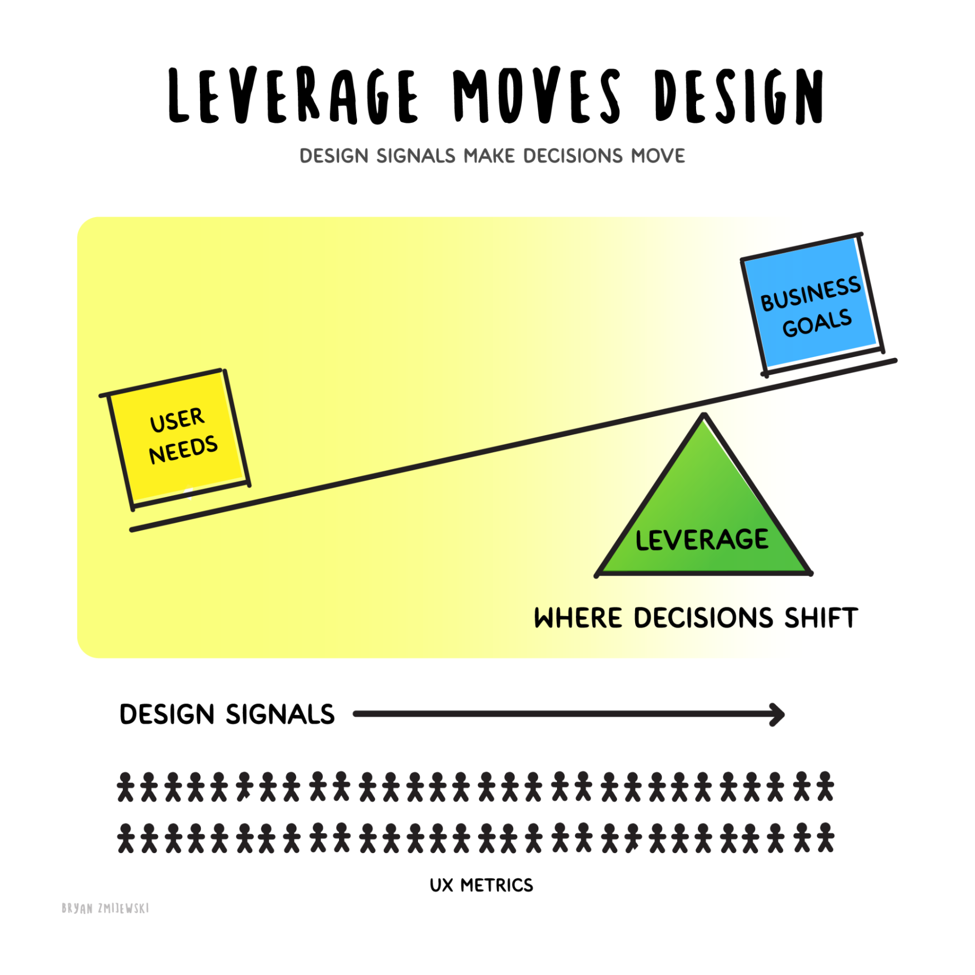
Design signals are directional. They shape where something goes, and we use them to drive the agenda.
The Prussian forest failed because one number ran everything. A signal with six parts, one of them human judgment, doesn't fail that way.
Where Santos is right
His anchor is real. I argue it just sits at the wrong end of a chain.
Attitudinal signals lead.
Behavior shifts.
Performance numbers lag.
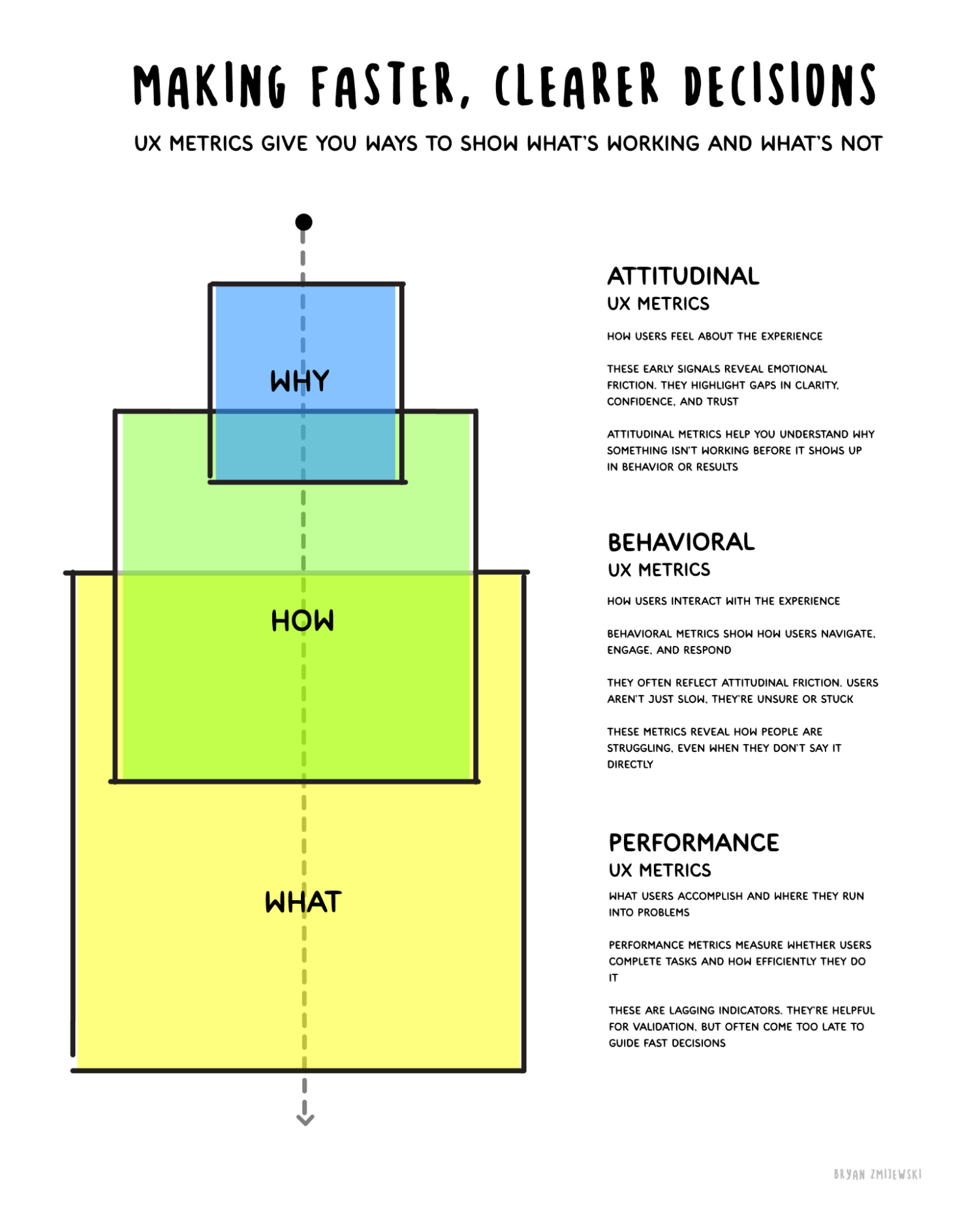
The design work is connecting that through line, so the leading indicator you captured before launch maps back to the operational number the business already counts.
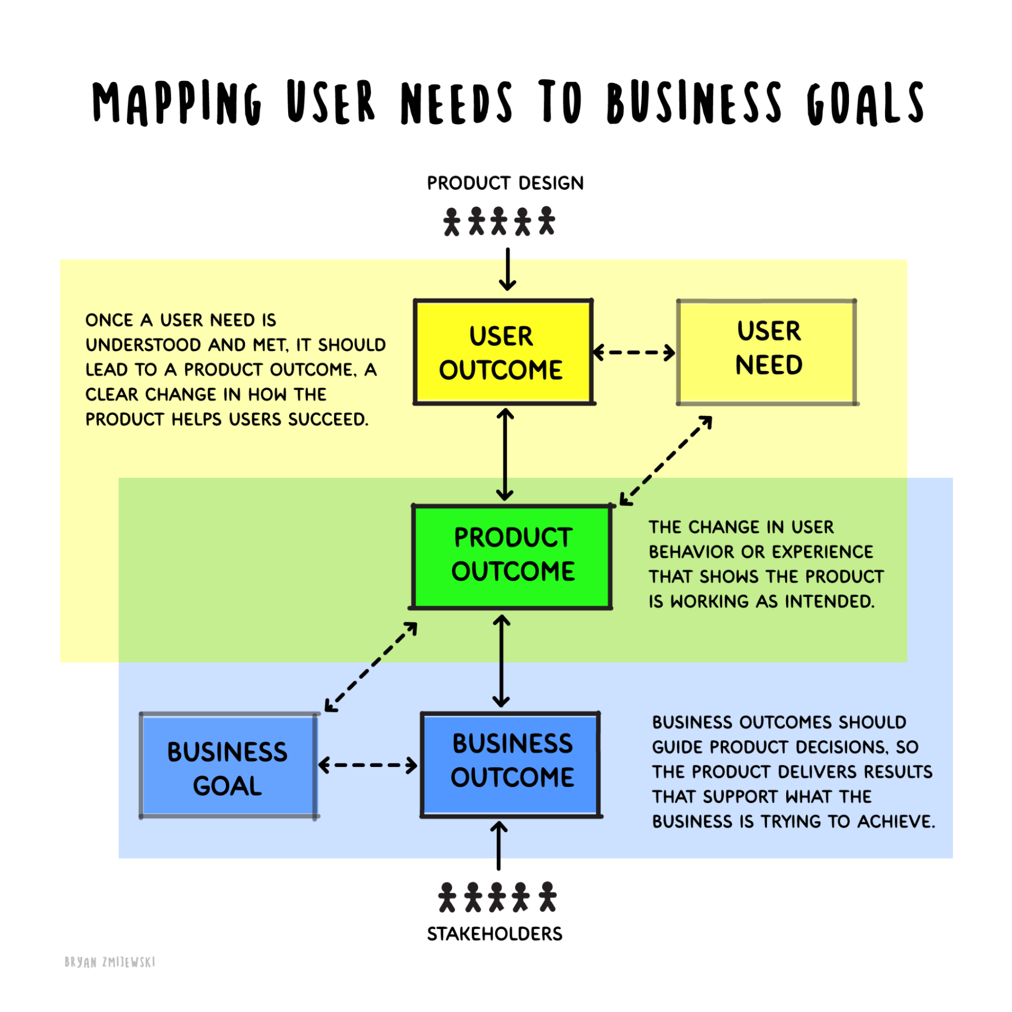
Some of those connections are real cause and some are coincidence. Telling them apart is judgment applied to the design problem, and it's where design leverage gets found. Once you can show that the thing you tested before launch is what moved that number, people start listening to you before you build. That's leverage, and you found it early.
So take Santos's advice, with one change. Pick a business number and map it back to the one people are already asking you for. Then go get your own numbers earlier in the process instead of waiting on theirs.
You are not going to talk your way into being taken seriously. Pick one thing you're arguing about right now, ask a hundred people, and bring the answer to the next meeting.