Financial websites rarely fail in obvious ways.
Login works. Onboarding completes. Dashboards load. Filters exist. Settings are configurable. And yet, across hundreds of real user sessions, a quieter and more dangerous pattern keeps showing up: loss of meaning at the moment decisions matter.
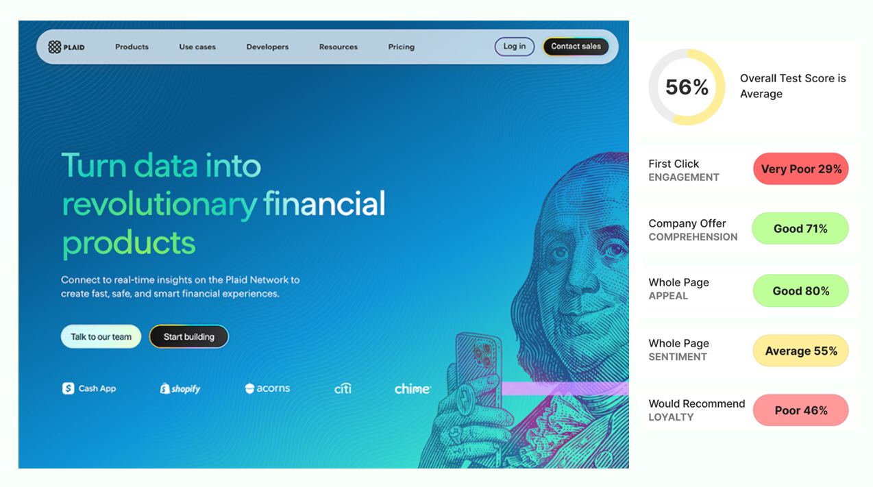
Over the past few months, we’ve run rapid UX tests across leading financial products and websites, including Robinhood, Nerdwallet, Ally, Chime, SoFi, Plaid, and others. We recorded thousands of financial professionals and consumers as they moved through real interfaces, revealing what actually drives clarity and trust. What people say is one thing. What their behavior shows is something else.
Five big ideas for financial products
- Login That Works Can Still Fail the Trust Test
- Onboarding Can Mask Low Commitment
- Mobile Dashboard Can Show Everything and Still Guide Nothing
- Hidden Filters Turn Decisions Into Search
- Control Without Context Creates Noise
If you lead marketing, digital, or design at a financial company, these patterns can help you spot issues that quietly slow teams down and erode conversion. This analysis brings together five recurring design signals where experiences technically work but fall short on guidance, reassurance, or trust. The result is polished interfaces that still ask users to do unnecessary mental work. To make this easier to apply, we’ve also created a simple financial experiment cheatsheet that captures what we’ve learned across dozens of tests.
Here’s what we are seeing.
1. Logins That Work Can Still Fail the Trust Test
Most financial teams treat login as a solved problem. Secure. Familiar. Technically sound. And in many cases, it is.
But the data shows something quieter.
Users can complete a login flow while still feeling unsure about what just happened, what the system knows about them, and what comes next. The experience “works,” but it does not fully earn trust.
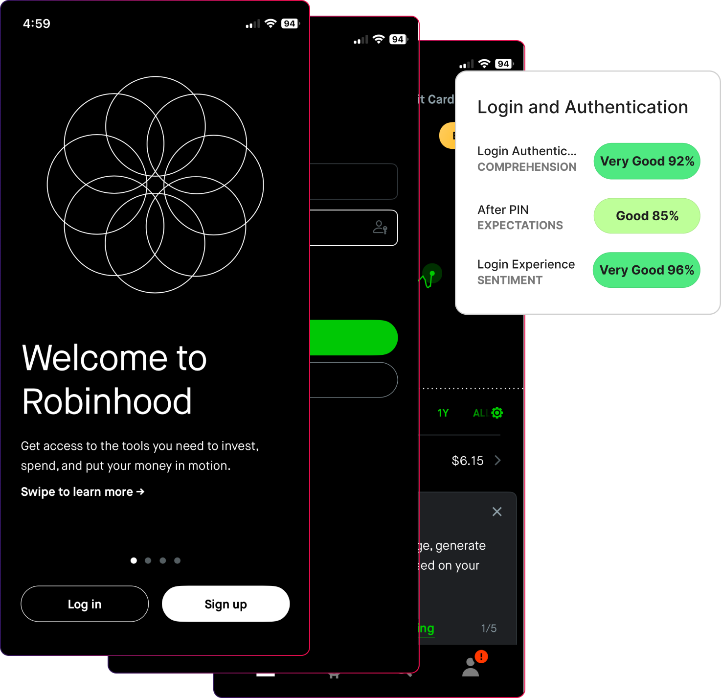
In this Robinhood login experiment, comprehension was high at 92 percent and sentiment stayed positive at 96 percent. Users moved through the flow without obvious friction. But follow-up responses revealed something important. People relied on familiar patterns rather than a clear understanding of what the system was asking them to do. The login required both a password and a PIN, which did not match many users’ expectations and left them advancing on assumption, not clarity.
Here are a few quotes on their expectations:
- “Not sure what it’s asking for.”
- “I was expecting a password, not a pin code.”
- “I was expecting a code to be sent to the email or phone number.”
- “It’s somewhat simple but a little confusing.”
- “I am pretty sure it would be an additional passcode to log in, like a text or email code.”
- “It worked, but I was expecting something different.”
That creates a false sense of confidence.
Users advance because they assume the system is competent, not because the system made its intent clear. When expectations are not reinforced immediately after authentication, trust quietly erodes even though nothing breaks.
This is the silent risk of login.
*Design Signal- Login is judged by whether they feel oriented, safe, and confident enough to continue once they arrive. Not whether users get access.
In financial products, trust is formed before users explore features. If login does not establish clarity, every screen that follows inherits that doubt.
What to Do Instead
Design login as an orientation moment, not a gate.
High-performing financial teams do four things differently:
- They make it obvious what is happening and why at each step.
- They confirm what the system knows and what it does not.
- They reinforce what users should expect immediately after login.
- They reduce emotional ambiguity, not just task friction.
This means testing more than completion.
Instead of asking: “Can users log in successfully?”
Ask:
- “Do users understand what the system is doing on their behalf?”
- “Do they feel in control after authentication?”
- “Do expectations match what they see next?”
Small changes in pacing, language, and feedback signals can dramatically change how trustworthy the entire product feels.
Login is the first promise your product makes. Strong teams make sure it is a promise users believe.
2. Onboarding Can Mask Low Commitment
Most financial teams judge onboarding by one number: Did users finish?
And in this case, they did. We tested Banko’s banking platform onboarding walkthrough (a white label bank for testing purposes) with 100 participants, and their responses were translated into UX metric scores. Completion is very high. Effort is low. The flow works.
Nearly all participants completed the onboarding flow (96%) because it feels familiar and procedural, not because it helps them understand why the product matters to them. They follow steps, answer questions, and move forward, but they are not yet anchored to a clear outcome.
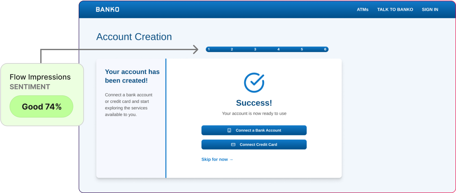
Sentiment (74%), while still good, trails slightly behind, indicating that while users appreciated the clarity and flow, the emotional tone of the experience could be more engaging or confidence-building.
Onboarding succeeds mechanically while remaining emotionally thin.
- “Usual information required but didn’t seem like anything new.”
- “It asked for the typical information any online banking signup would require.”
- “I found it to be a typical application process.”
*Design Signal-When onboarding focuses only on efficiency, users comply, but may not understand why the setup exists and what it unlocks.
What to Do Instead
High-performing teams treat onboarding as a narrative, not a checklist.
They:
- Explain why information is being requested, not just what is required.
- Connect each step to a future benefit or outcome.
- Reinforce what users should expect immediately after onboarding ends.
- Test for understanding, confidence, and readiness, not just completion.
Instead of asking:
“Can users finish onboarding?”
They ask:
- “Do users understand what they can now do?”
- “Do they feel confident taking the next action?”
- “Does this flow build trust or just avoid friction?”
Onboarding is the moment where a financial product either earns long-term engagement or quietly becomes forgettable.
3. A Mobile Dashboard Can Show Everything and Still Guide Nothing
Mobile dashboards are meant to give users confidence at a glance. The Bank of America mobile app people open multiple times a day to answer one simple question:
“Am I okay right now?”
On the surface, this dashboard performs well. Information is visible with usability at 83%. Key balances are clear. Core services are accessible with next steps at 89%. Users recognize the layout and understand what each card represents.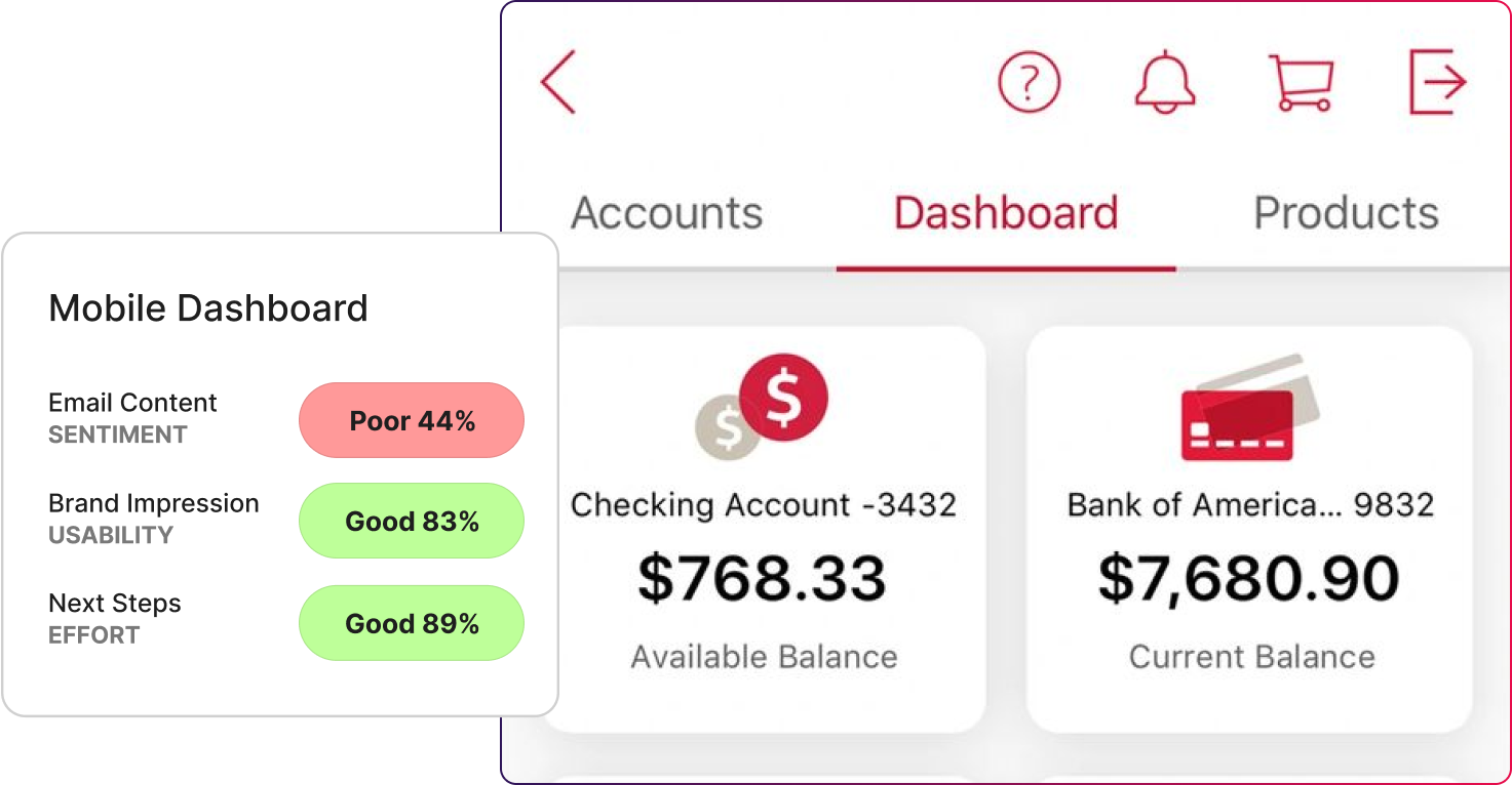
But the data shows something more telling.
Users can read the dashboard, but they are less certain about where to focus and what action matters most right now. The screen presents many signals at once without helping users prioritize.
Everything is visible. Direction is diluted.
* Design Signal- A mobile dashboard succeeds when it tells users where to look first.
What to Do Instead
High-performing teams design mobile dashboards around priority, not parity.
They:
- Highlight the single most important signal for the user right now.
- Use visual contrast to surface urgency, not just brand consistency.
- Separate “status” from “action” clearly.
- Test whether users know what to do next within the first few seconds.
Instead of asking:
“Can users see their information?”
They ask:
- “Do users know what matters most right now?”
- “Does the dashboard reduce scanning or increase it?”
- “Are we helping users feel in control, or just informed?”
A strong mobile dashboard does not just report status. It helps users decide what to do next, fast.
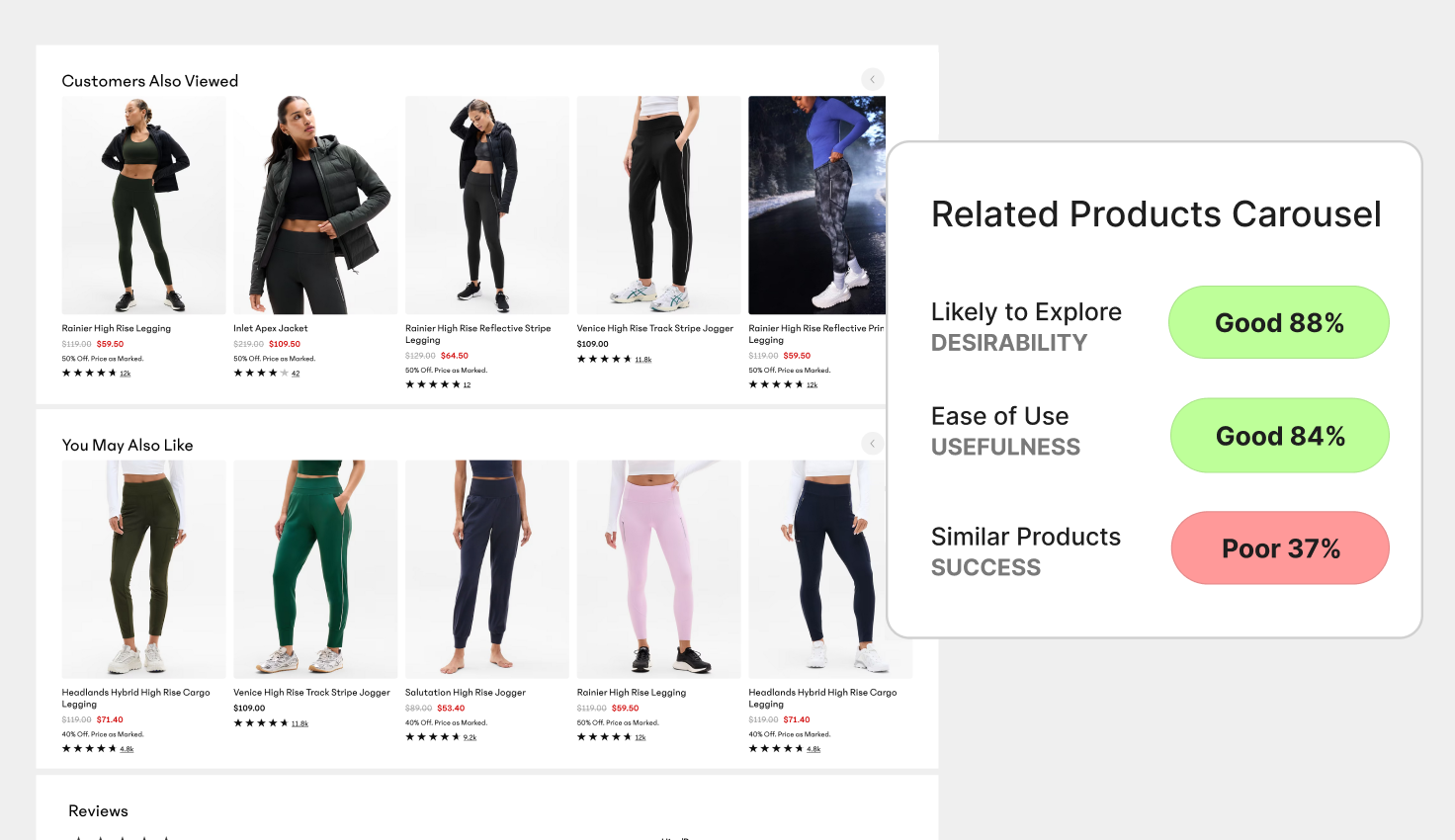
4. Hidden Filters Turn Decisions Into Search
Filters are supposed to make decisions easier. They exist to reduce options, narrow focus, and help users act with confidence.
But in this test, they did the opposite for a meaningful portion of users.
On the surface, things looked fine. Most participants eventually completed the task. Many rated the experience as “okay” or “easy.”
But when we looked closer, a clear pattern emerged.
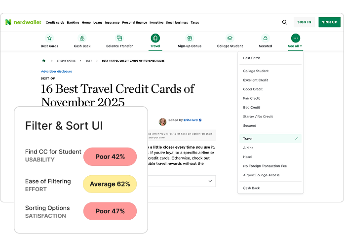
Roughly 20% of participants struggled, and that struggle correlated directly with:
- higher effort scores (62%)
- longer time to complete tasks (24 seconds)
- missed or misinterpreted options (42%)
The issue wasn’t complexity. It was visibility. And you can see the drop.
Design Signal- Hidden filters turn a decision task into a search task.
What to Do Instead
High-performing financial teams design dashboards as decision surfaces, not status displays.
They:
- Surface the most important criteria upfront.
- Separate filtering controls clearly from site navigation.
- Avoid hiding high-impact options behind secondary menus.
- Test for time to decision, not just task completion.
Instead of asking: “Can users apply filters?”
They ask:
- “Can users immediately see the criteria that matter?”
- “Do filters reduce effort or add another layer of work?”
- “Are we helping users decide, or making them search?”
Filters should narrow choices. Don't slow them down.
5. Control Without Context Creates Noise
Notifications are supposed to help users stay informed without pulling them out of control. In financial products, they sit at a delicate intersection of urgency, trust, and attention.
On the surface, this notification experience performs well. Usability is strong. Intent is high. Comprehension is clear. Most users can find notification settings, understand categories, and toggle options without much friction.
But the data shows something more subtle in people who had a lower sentiment about the experience. Emotional response was mixed, with sentiment at 67%. While the interface felt clean and trustworthy, a subset of users expressed neutral or mildly frustrated impressions tied to the small usability hurdles in finding specific controls.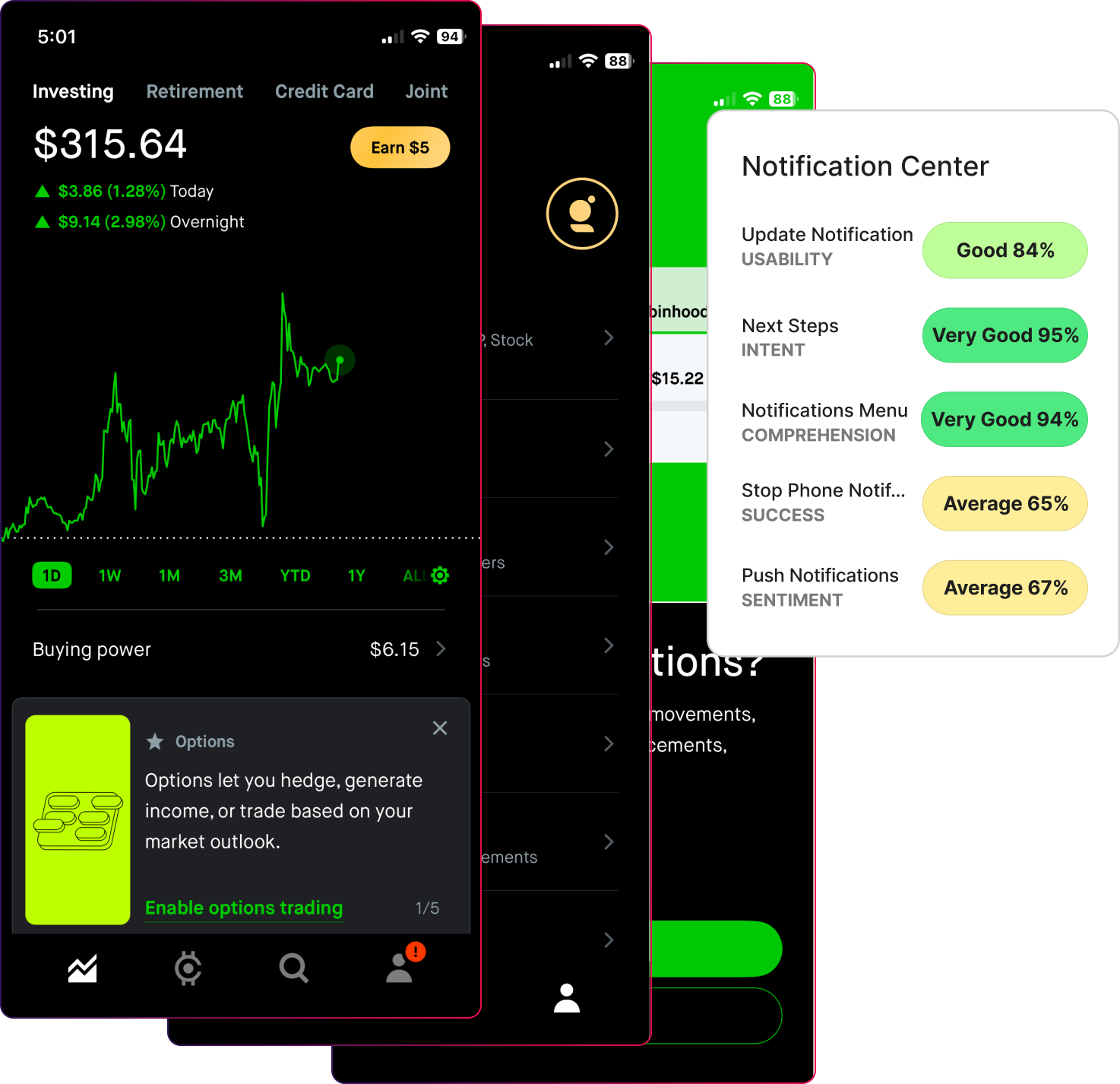
Users know how to manage notifications, but they are less clear on why they should receive certain alerts and what impact those alerts will have. The interface gives control, but little guidance.
The system is configurable. The meaning is thinner.
Participants expressed their thoughts about the notifications:
“Have to read through details to understand…not easy.”
“It looks like there are two different ways that each item is showing, the toggle switch and then the arrow option to go to another screen. Shouldn’t they all look the same for it to be more uniform and clear?.”
*Design Signal-Notification settings should help users decide what deserves attention.
What to Do Instead
High-performing teams design notification centers around priority and consequence, not just flexibility.
They:
- Explain why an alert exists before asking users to enable it.
- Clarify what action, if any, a notification supports.
- Group alerts by importance, not just category.
- Reinforce which notifications protect users versus which simply inform.
Instead of asking: “Can users manage notifications?”
They ask:
- “Do users understand which alerts matter most?”
- “Does this setup reduce anxiety or increase it?”
- “Are we helping users stay informed, or just stay interrupted?”
Notifications should not compete for attention. They should earn it.
The Bottom Line: Completion Does Not Mean Users Feel Confident
Users complete financial tasks because the interface allows them to. That does not mean they feel certain about what just happened.. They are seeking orientation, priority, and reassurance.
Across login, onboarding, dashboards, filters, and notifications, the same truth appears:
- Completion does not equal trust
- Visibility does not equal direction
- Control does not equal confidence
High-performing financial teams design for decisions, not just interactions. They test whether users feel oriented after login, anchored after onboarding, guided on dashboards, supported by filters, and protected by notifications.
The teams that win do not ask, “Can users get through this?”
They ask, “Do users know what matters now, and why?”
That shift is when design stops being decorative and becomes strategic.
Five High-Value Ways We Help Financial Teams Improve Their Websites
If you need support cutting through the complexity of your financial website, we’re here to help. We work with an audience of over one million participants and use insights from 50,000 hours of testing and five million responses to surface the clarity your users need to move forward with confidence.
1. Make your design work credible and reusable across the organization
We turn website signals into simple proof stories that build executive trust and guide marketing and product decisions.
2. Give you the fastest path to real user input without slowing the team
We test with real financial professionals in days so your site keeps pace with market expectations.
3. Turn vague website messages into clear business outcomes
We translate complex financial offerings into simple value that shows how your product reduces risk or improves operations.
4. Bring discipline to your metrics so teams stop arguing
We help you choose the right UX and business signals for financial journeys so everyone aligns on success.
5. Reveal the real problems worth solving fast
We pinpoint where financial buyers get stuck and highlight the highest impact fixes for adoption and evaluation.
Powered by Froala Editor